The independent samples t-test makes several important assumptions. As you review this portion of the tutorial, it is helpful to indicate whether your data passes each assumption. Among other things, this will influence how you write your the final writeup.
(1) Your samples should be randomly selected.
This is vitally important. If your samples are not randomly selected from the population of interest (or at least sampled in a way that approximates random sampling), then you will not be able to draw any conclusions about your population of interest, and your results will be unreliable. If you are dividing participants into a treatment groups, it should be done in a random way.
Despite this, researchers often use t-tests with samples of convenience, because this assumption is hard to meet — for example, a lot of social science research is conducted using undergraduate student volunteers (rather than participants randomly sampled from the general population). In these cases, the groups should be divided randomly. Further, good researchers always identify their sampling methods and, if the sample is not a true random sample, they will report this as a potential weakness of the study.
This will be a weakness of your study that will need to be reported if you continue to perform an independent samples t-test. Samples of convenience are often used in social science research, but in these cases, the sampling methods should be reported as a potential weakness of the study.
(3) Your samples should be (approximately) normally distributed.
The values of the dependent variable should approximate a normal curve for each sample. This assumption is vital if you have a small sample size. If you have an fairly large sample size (and if your samples have approximately equal variances), this assumption becomes less important, but it's important to report violations of the assumption anyways.
There are three ways to test this assumption in R: a histogram, a Q-Q plot, and a Shapiro-Wilk hypothesis test. We recommend that you do all three. For experienced data scientists, the Q-Q plot can be more sensitive to problematic violations of normality. The Shapiro-Wilk test is easy to report, but is sometimes criticized as arbitrary.
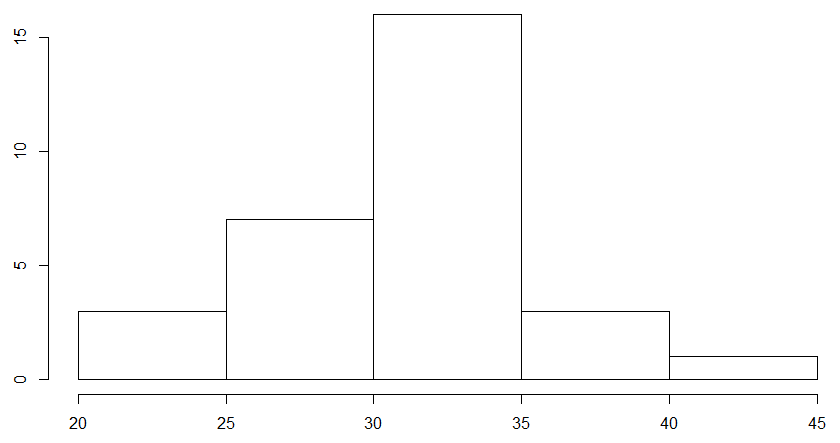
Histogram
To create a histogram of your data, simply use the following code (for both samples):
hist(my_data$Plant_Height[my_data$Soil_Type == "Soil_A"])
hist(my_data$Plant_Height[my_data$Soil_Type == "Soil_B"])
This will create two histograms, one for each sample in your data. For us, it created a histogram of plant heights for Soil A and then for Soil B, respectively, which looked something like this:
These plots will show up in the "Plots" tab of your workspace, and you can use the arrow buttons on the tab to cycle through plots that you have made. To check if your data is normal, look and see if the data roughly resembles a "bell curve." If it does, then your data may be normally distributed.
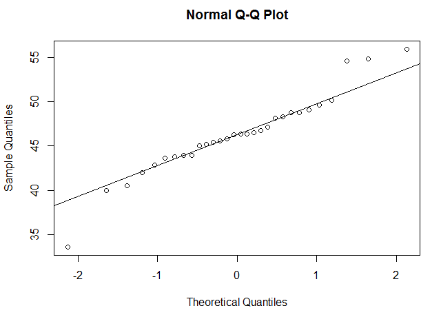
Q-Q Plot
A Q-Q plot is short for a quantiles-quantiles plot. It takes each data point in your data and plots them against what they would be if your data were normally distributed. For example, if you have 50 data points, it calculates 50 "quantiles" from a normal curve, and plots your data against the normal data. If your data is normally distributed, this should result in a roughly straight line. To create a Q-Q plot in R, you will use the R functions qqnorm() and qqline(), as below:
qqnorm(my_data$Plant_Height[my_data$Soil_Type == "Soil_A"])
qqline(my_data$Plant_Height[my_data$Soil_Type == "Soil_A"])
qqnorm(my_data$Plant_Height[my_data$Soil_Type == "Soil_B"])
qqline(my_data$Plant_Height[my_data$Soil_Type == "Soil_B"])
This will create two Q-Q plots, one for each sample in your data. For us, it looked something like this:
If the data points are roughly in a straight line, this means your data may be normally distributed. How "non-straight" can the line be before you get concerned? This takes some practice and human judgment. We've included below a way to "practice" and see how different distributions look on a Q-Q plot, so that you familiarize yourself with how to tell if your data is probably normally distributed.
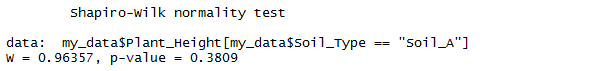
Shapiro-Wilk Test
The Shapiro-Wilk test checks for non-normality using a hypothesis test. The Shapiro-Wilk test treats your data as a sample from a normally distirbuted population. The Shapiro-Wilk test asks, "Assuming that the data waspulled from a normally distributed population, what is the likelihood of getting data as non-normal as this?" If the likelihood is large, we might conclude that our population is normally distributed; if the likelihood is small, we might conclude that our sample is fairly non-normal.
We can perform the Shapiro-Wilk test using the code below:
shapiro.test(my_data$Plant_Height[my_data$Soil_Type == "Soil_A"])
shapiro.test(my_data$Plant_Height[my_data$Soil_Type == "Soil_B"])
The test will produce two values: W, and p, which is the probabilty of obtaining the W-score if we assume that our data was pulled from a normal distribution. For us, it looked like this:
If the p-value is less that .05, then we can make an argument that our data is unlikely to have come from a normal distirbution. Note, however, that this can be pretty arbitrary — a p-value of .06 can still pass this test, which means that non-normal data can pass the Shapiro-Wilk test pretty often. For this reason, the Shapiro-Wilk test should be used together with visual tests such as histograms and Q-Q plots.
Detecting Non-normal Data
Below are three different ways to detect non-normal data. The first is a histogram, the second is a Q-Q plot, and the third is the Shapiro-Wilk test. Click on the buttons below to generate random distributions of different kinds (clicking on the same button will generate a new random sample). Observe how the various plots look, and the results of the Shapiro-Wilk test. The purpose of this demonstration is to help you become familiar with the strengths and weaknesses of each approach.
Warning: Each "normal" sample is randomly selected from a normal distribution, and each "skewed" sample is randomly selected from a skewed distribution. This does not guarantee that the actual samples will be normal or skewed, due to random sampling variation. Also, ignore the dot in the upper left corner of the Q-Q plot. I can't seem to get rid of it.
Shapiro-Wilk Test
W = value, p = value Clearly a bug. Working to fix.
If your sample size is large, this may not be an issue (but you will still want to report this). If your samples size is small, however, it may be an issue. Here are some ways to deal with this:
(4) The variances of your two samples should be similar.
If you have one group where the measurements are all alike, and another group where the measurements are all over the chart, the t-test is not as reliable a test to run. This is part because the t-test makes inferences about the variances of the underlying populations based on the variances of your samples. Without homogeneity ("sameness") of variances, the results of your traditional independent samples t-test cannot be trusted.
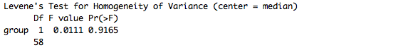
Levene's F test
This is assumption is most often tested using Levene's F test for equality of variances. Like the Shapiro-Wilk test, this is also a hypothesis test. The Levene's F test is contained in a package called car, which typically comes preinstalled. You'll need to load this library to perform the test. To perform the Levene test, simply use the following code:
library(car)
leveneTest(Plant_Height ~ Soil_Type, my_data)
This code performs the Levene's F test, which for us looked like this:
If the p-value is less than .05, then we can make an argument that our variances are unlikely to be similar. That's a weird way to say it, but it's also the most precise. We could also say that our variances are likely to be different. Note, however, that this can be pretty arbitrary.
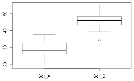
Boxplot
For this reason, many people use with visual tests such as box plots to supplement Levene's F test. to do this, you can use this code:
boxplot(my_data$Plant_Height ~ my_data$Soil_Type)
This produces a box plot for each sample. For us, it looked like this:
Notice that for us, the box plots look fairly similar -- one does not look substantially taller than the other. This won't always be the case. If your data fails this assumption, one plot may have a much "taller" box plot. We've provided a tool below that will display a number of randomly generated data sets to illustrate this, for practice.
Detecting Unequal Variances
Below, we have a boxplot of two variables, and also the results of the Levene test. The purpose of this demonstration is to visually depict the relationship between the variances of the samples and the results of the Levene test.
Boxplot, N = 300
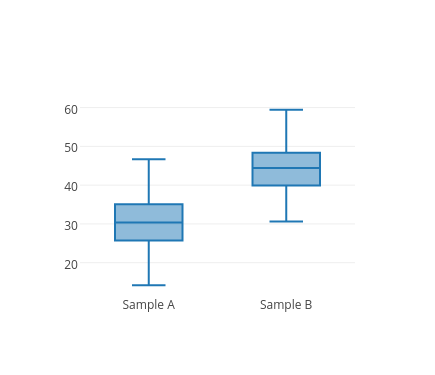
Levene's Test
F = 1.004, p = 0.317
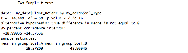
When your variances are not equal, there is a variation of the t-test that can be performed (the Welch's independent samples t-test). So don't fear! We'll show you below how to do this. It's important to note this and use the alternative test when necessary. Some argue that the Welch's independent samples t-test can be used even if the variances are equal, so it's pretty reliable.